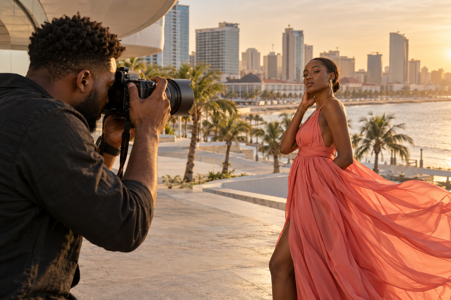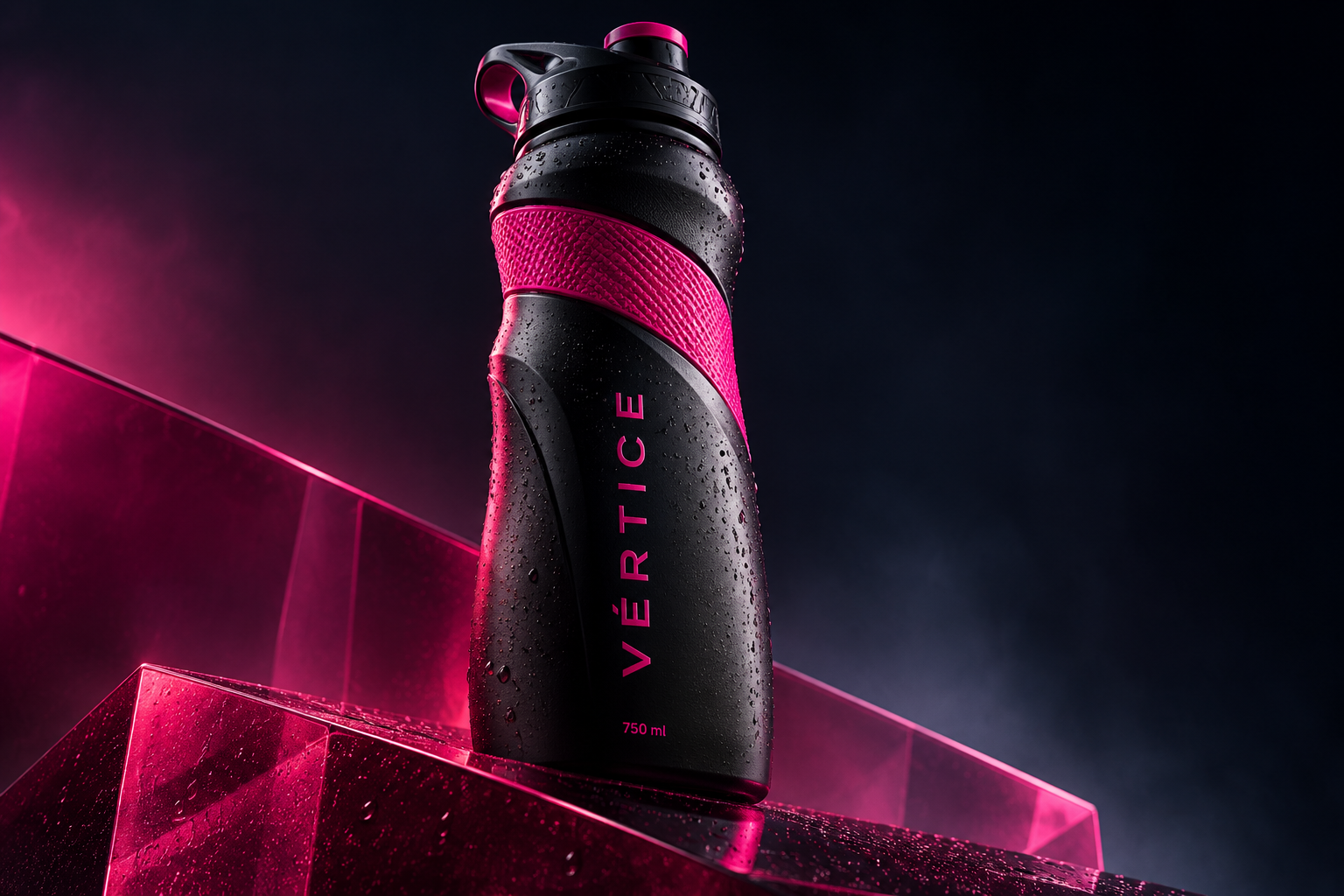
Positioning and consistency guide visual choices.
Start with the right question
Before choosing colours, I try to understand the business: what it offers, who it serves and how it wants to be recognised. This context helps distinguish an aesthetic preference from a useful brand decision.
Build a system
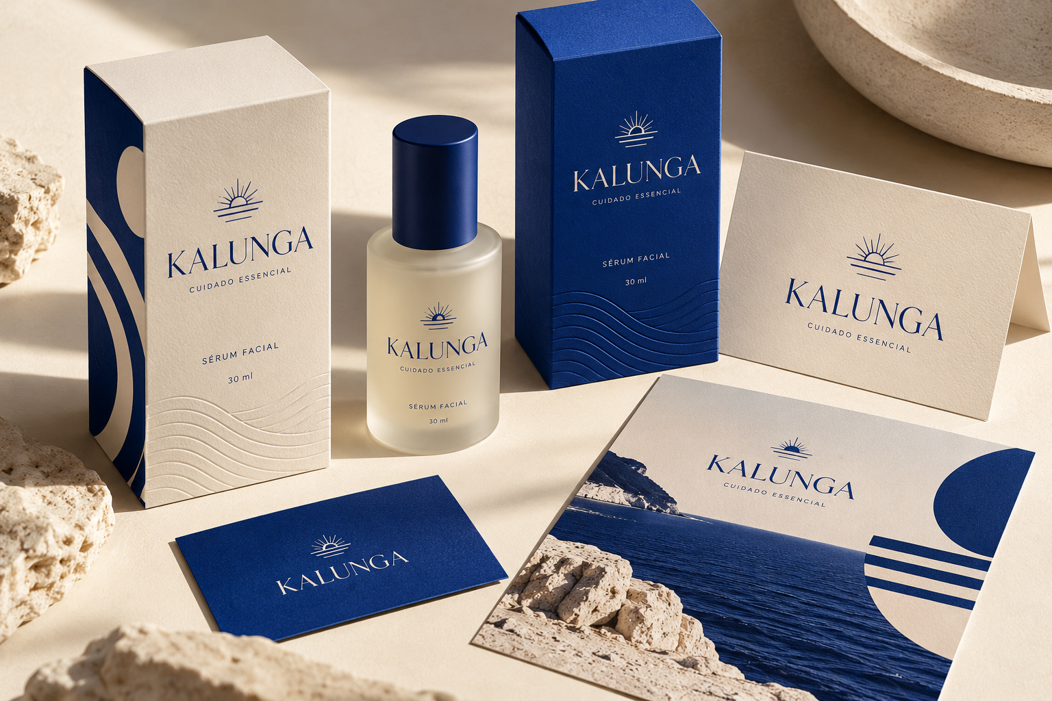
The logo is part of a system. Typography, photography, tone of voice and composition need to work together, from a small icon to a business presentation. Testing real applications reveals adjustments that an isolated mark on white may hide.
Maintain direction
An identity should allow variety without losing recognition. I like to define usage examples, spacing and relationships between elements. The team then has a foundation for new materials instead of starting from scratch with every post.